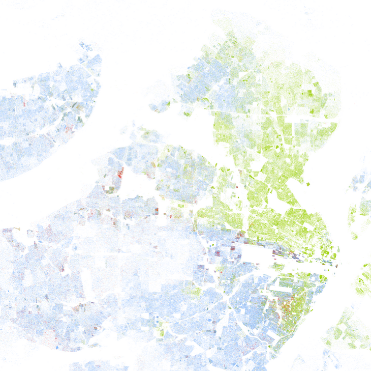
In honor of this week’s Dr. Martin Luther King Day holiday, we encourage you to explore the continued pattern of racial segregation in housing with this map from the Weldon Cooper Center for Public Service at the University of Virginia. The map has one dot for every person in the United States as of the 2010 Census, with different colored dots for people reporting different races or ethnicities on the Census: red for Asian, orange for Hispanic, green for African American, blue for white, and brown for other. The image below shows St. Louis, Missouri, and its suburbs from this map.
Image Copyright, 2013, Weldon Cooper Center for Public Service, Rector and Visitors of the University of Virginia (Dustin A. Cable, creator)
