Oftentimes the best way to learn about how to do something right is by learning what not to do, especially for how to make good data visualizations. WTF Visualizations is a website that compiles poorly crafted data visualizations from across the web and media. Below is a sampling of some of the visualizations featured that illustrate some of the most common data visualization mistakes:
- Absence of Proper Scaling
Including proper scaling is essential in accurately representing your data. In the example below, the differentiation between values is misrepresented due to the absence of a clear scaling measure. The 52% measure does not appear to be as large as it should be in comparison to the other bars, and the 13% figure appears to be much larger than 3% when compared to the two 10% figures.

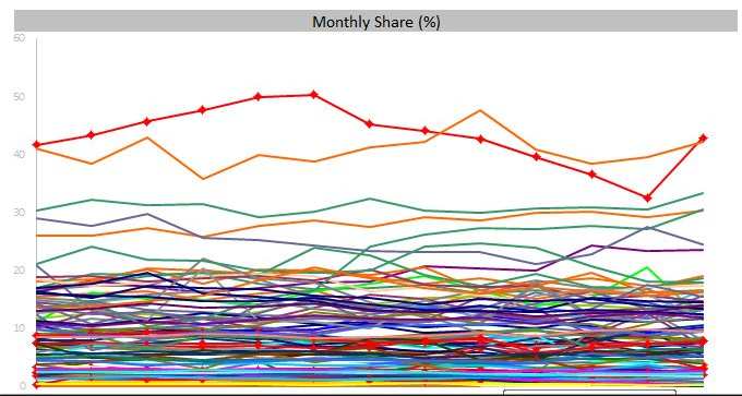
- Too Much Information
While the inclination is to include as much information in visualizations as possible, oftentimes including too much information detracts from the clarity and concision that is essential to good data visualization. The example below perfectly illustrates how including a myriad of different categories can muddle your visualization, as well as the importance of clear axis labels and descriptive titles.
Ensure that the data that you do decide to visualize is comprehensible to your audience: recode categories when there are too many; don’t include measures that illustrate the same phenomenon; don’t include 10 different variables when 3 will do. If need be, include more than one visualization to highlight different sub categories or variables.
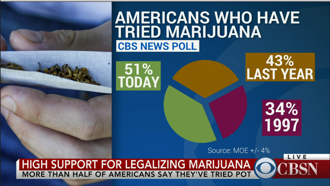
- Bad Math
Always double check your math before sharing your visualization to the public. You may run the risk of misrepresenting your data, as well as appearing as though you are not capable of simple arithmetic. The example below illustrates this point perfectly: while the creator uses a pie chart, the sections do not add up to 100%, but rather, 128%. The sections of the pie chart also do not accurately reflect the values they supposedly represent: The “51% Today” section, for instance, should be taking up a little more than half of the pie chart.