Data do not speak. As has famously been noted, data and especially data displays –whether maps, statistics, or word clouds– can lie or at least be deceptive. Access to easy methods for generating visualizations and analyses may be as dangerous as liberating, unless we are careful as both producers and consumers.
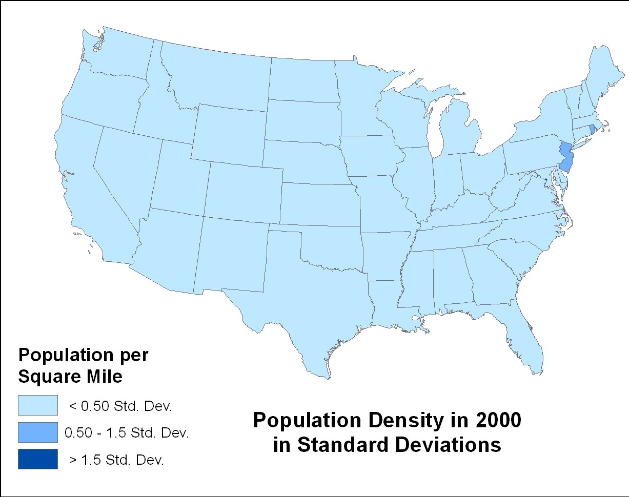
The following three maps all show exactly the same data, but look very different—due to the choices made in display.


The first map uses natural breaks in the data to separate categories. The second uses quartiles, a measure based on medians. For this the states are separated into 4 equal piles and the most densely-populated states are given the darkest color. Note how much variation this group exhibits. While the least dense two groups have only a small range, the range for the most densely populated is huge.
The third map has the real problem, however. While we see lots of variation in the first two maps, in the one below it looks as if the entire country has the same population density. We know this is WRONG.
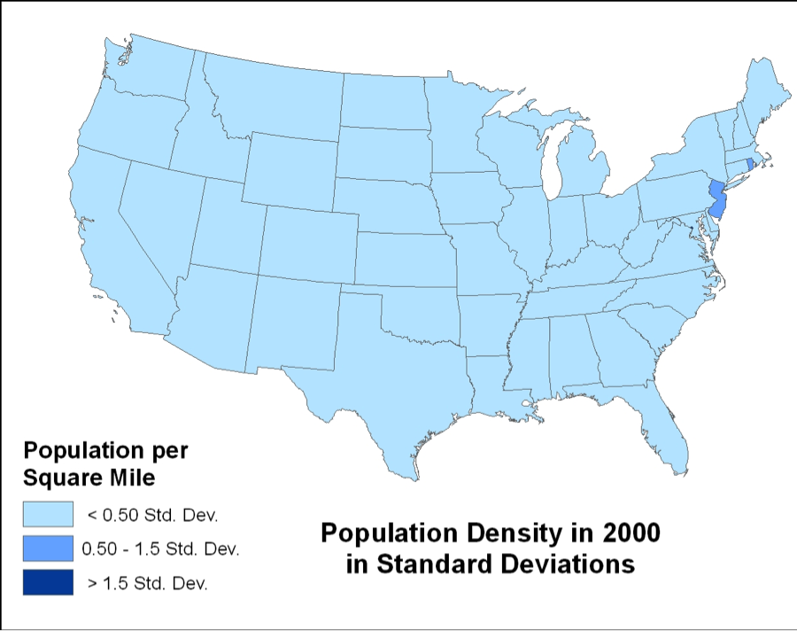
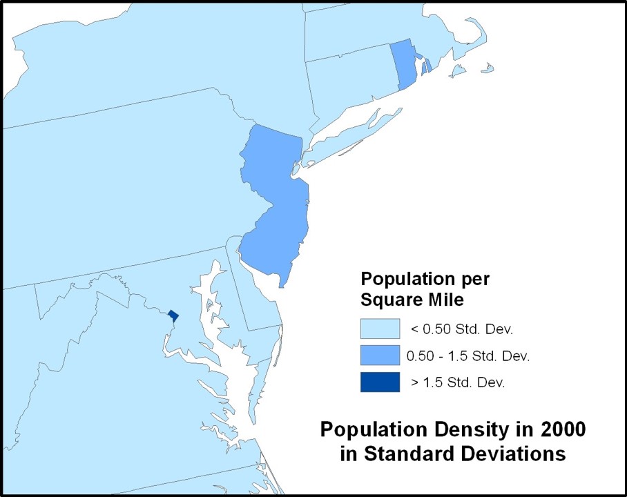
The standard deviations we relied on to display the data are very sensitive to outliers to display the data. Washington D.C. and to a lesser extent New Jersey and Rhode Island are causing the problems because their population densities are so much greater than anyone else’s. Essentially, their high population densities mask the variability in the rest of the data. Standard deviations with big outliers work this way, but this is much more obvious in visualizations like the ones above.
Data can appear to lie, but only when we are purposely or accidentally complicit. Take a look, for example at the first map below. At first blush the headline CRIME WAVE HITS CALIFORNIA, TEXAS, NEW YORK, AND FLORIDA seems warranted. After all you can see the patterns clearly in the map.


But, if you look at the data another way, you will see you have been deceived. In the first map above the big, populous states are identified as the villains, at least in part because they have more people and, all things being equal, more people commit more crimes. An examination of the number of violent crimes for every 100,000 people in the map to the right tells quite a different story.
While the need to standardize data by using proportions, percentages, and ratios rather than using raw numbers may seem obvious, it is a not uncommon error and just one of the many ways that inadvertently or on purpose we can all lie with data and visualizations.