Data do not speak. As has famously been noted, data and especially data displays –whether maps, statistics, or word clouds– can lie or at least be deceptive. Access to easy methods for generating visualizations and analyses may be as dangerous as liberating, unless we are careful as both producers and consumers.
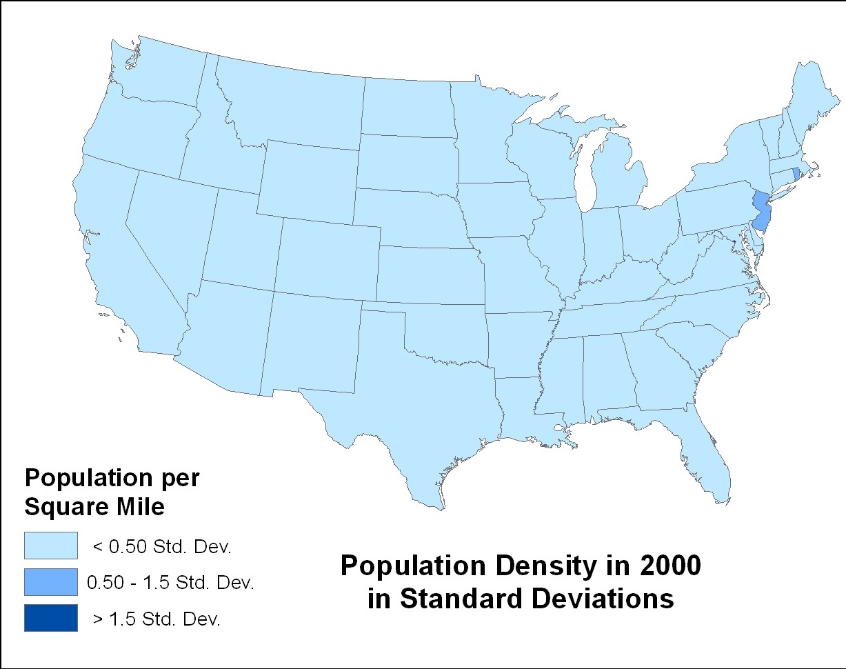
The following three maps all show exactly the same data, but look very different—due to the choices made in display.


The first map uses natural breaks in the data to separate categories. The second uses quartiles, a measure based on medians. For this the states are separated into 4 equal piles and the most densely-populated states are given the darkest color. Note how much variation this group exhibits. While the least dense two groups have only a small range, the range for the most densely populated is huge.Read More »Teaching Basic Quantitative Concepts with Visualizations