This page introduces the tutorials of using Tableau for data visualization tasks. There are four tutorial videos as follows:
Introduction to Tableau
First video includes (Introduction to Table, Basics of setting up your visualization, and Make your first visualization: Bart Chart):
https://us-lti.bbcollab.com/recording/921f52088fe7422bb7074356b7f604f6
Line Charts
Second video includes (Line Charts which works with time variables):
https://us-lti.bbcollab.com/recording/50e3d38491ac4d54937f5968b892ea3d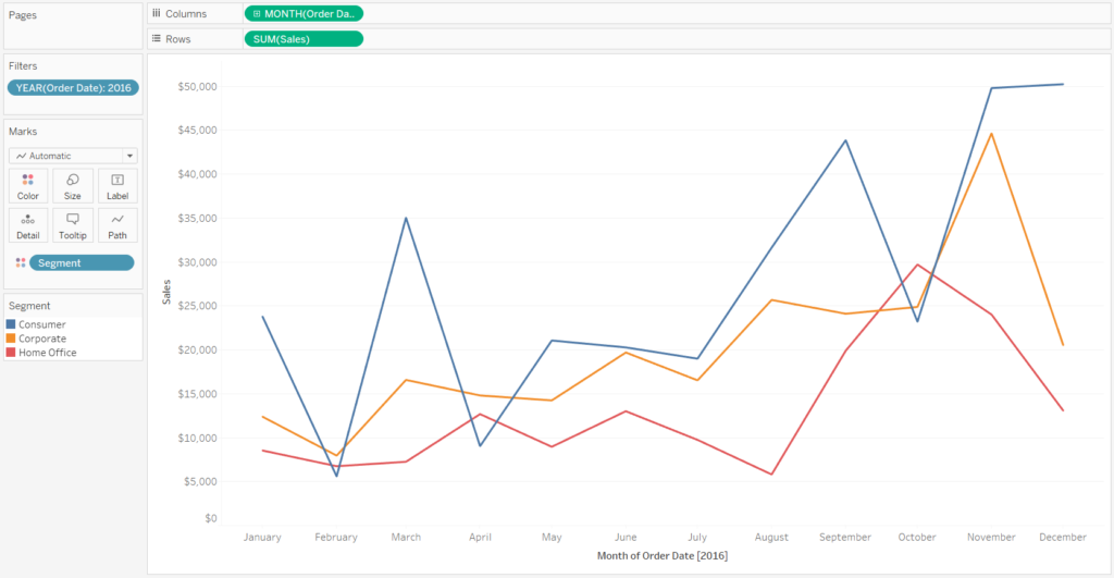
Maps
Third video includes (Maps which working with different locations)
https://us-lti.bbcollab.com/recording/85826dea23f94169a334a9e710ec403d
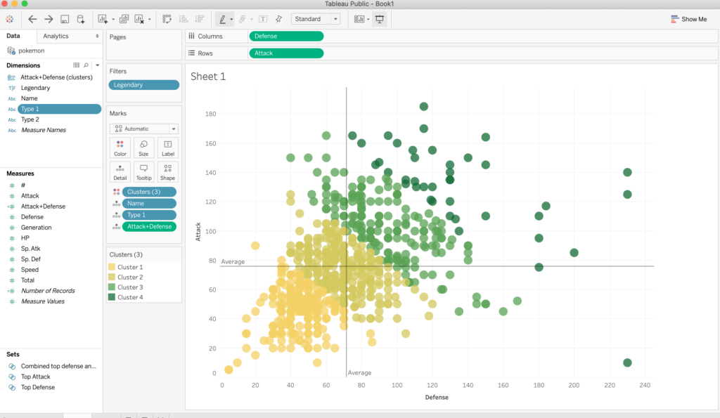
Scatter Plot
Third fourth video includes (scatterplot which working with continuous variables, exporting your visualization)
https://us-lti.bbcollab.com/recording/ed898b26664849c8904967b58542e7e6