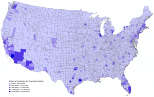
In honor of the end of tax season, we have created a few maps showing various tax related statistics from the IRS. The IRS
has a number of great data sets available for public use. We thought it would be interesting to map out some of their tax return data from 2012.
First, let’s look at how much Americans received in tax refunds. This map shows the total dollar amount, in thousands, each county received in returns total for 2012.
This map of the number of returns with renewable energy tax credits offers a slightly different look of the US. Again, these data are the total dollar number of returns for each county in 2012. It would be interesting to see the increase in renewable energy tax credits over time.
Most of these maps have a higher concentration of tax returns and return amounts in metropolitan areas. The map of farm returns by county shows a contrast.
We hope to make this an interactive data visualization soon.


