In recent years programs like ArcGIS and Tableau have made it very easy to produce maps. Journalists have responded by richly illustrating their articles with quantitative data displayed as maps. Maps are both attractive and easier to explore visually than the same data provided in tabular form, so in many ways they are ideal illustrations. For the average reader information transmitted as quantitative data appears authoritative and these maps are no exception. On the surface they seem real and informative. Unfortunately, just as with any data-driven information maps can inadvertently be misleading.
In a recent example, NBC news illustrates an article about the Supreme Court consideration of a Texas law that would force the closure of a high percentage of existing abortion clinics across the country were similar laws to be enforced or enacted more broadly with a map of the U.S. showing the number of abortions per state in 2012, using data from the CDC (Center for Disease Control).
A quick perusal of this map seems to show why Texas is so concerned about abortions. After all it is one of the states with the most abortions. After a moment’s examination, the viewer might (or might not) note that the states with the highest populations also seem to have the largest numbers of abortions.

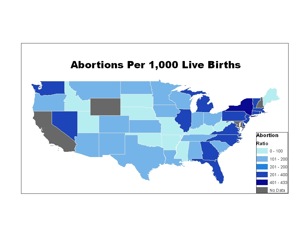
Thus, this map really tells us little about which states have the biggest problem with abortions. Some kind of standardization by population is needed. One option would be to just use population size. Since the number of women of women who might potentially become pregnant and secure an abortion (usually defined as the number of women between 15 and 44) does not necessarily vary by state in direct proportion to the population size, this statistic may be a better measure for standardization than simple population size. In terms of the number of abortions per 1,000 women ages 15-44 Florida and New York have high rates of abortions, but Texas no longer looks unusual.

But this still might not be the most revealing measure to use, since there is state to state variation in the birth rate. In 2012 the average birth rate for the U.S. was 1.88, but Texas had a birth rate of 2.08. The highest birth rate in the 50 states was 2.37 in Utah and the lowest 1.59 in Rhode Island. An option that takes into account the differential birth rates is to examine the ratio between the number of births and the number of abortions. Using this measure, New York remains very high, but due to its relatively high birth rate Texas is even lower.

The CDC provides all of these statistics, but the journalist chose the least revealing of the possible measures to display. Journalists are generally both well-educated and, we assume, well-meaning. Why not pick a better measure to map when it would have been equally easy to do so? I suspect that the answer lies firmly in the laps of educators like myself. While we prioritize skills like writing and speaking well, we do not mandate that all students graduate statistically or even quantitatively literate, but we should.