Will sales of a good increase when its price goes down? Does the life expectancy of a country have anything to do with its GDP? To help answer these questions concerning different measures, researchers and analysts often employ the use of regression techniques.
Linear regression is a widely-used tool for quantifying the relationship between two or more quantitative variables. The underlying premise is simple: no more complicated than drawing a straight line through a scatterplot! This simple tool is nevertheless used for everything from market forecasting to economic models. Due to its pervasiveness in analytical fields, it is important to develop an intuition behind regression models and what they actually do. For this, I have developed a visualization tool that allows you to explore the way regressions work.
You can import your own dataset or choose from a selection of others, but the default one is information on a selection of movies. Suppose you want to know the strategy for making the most money from a film. In regression terminology, you ask what variables (factors) might be good predictors of a film’s box office gross?
The response variable is the measure you want to predict, which in this situation will be the box office gross (BoxOfficeGross). The attribute that you think might be a good predictor is the explanatory variable. The budget of the film might be a good explanatory variable to predict the revenue a film might earn, for example. Let’s change the explanatory variable of interest to Budget to explore this relationship. Do you see a clear pattern emerge from the scatterplot? Can you find a better predictor of BoxOfficeGross?
If you want to control for the effects of other pesky variables without having to worry about them directly, you can include them in your model as control variables.
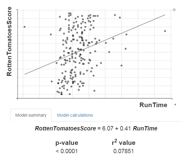
Below the scatterplot are two important measures that are used in evaluating regression models: the p-value and the R2 value. What the p-value tells us is the probability of getting our result just by chance. In the context of a regression model, it suggests whether the specific combination of explanatory and control variables really do seem to affect the response variable in some way: a lower p-value means that there seems to be something actually going on with the data, as opposed to the points being just scattered randomly. The R2 value, on the other hand, tells us how what proportion of the variability in the response (predicted) variable is explained by the explanatory (predictor) variable, in other words, how good the model is. If a model has a low R2 value and is incredibly bad at predicting our response, it might not be such a good model after all.

If you want to predict a movie’s RottenTomatoesScore from its RunTime, for example, the incredibly small p-value might tempt you to conclude that, yes, longer movies do get better reviews! However, if you look at the scatterplot, you might get the feeling that something’s not right. The R2 value tells us this other side of the story: though RunTime does appear to be correlated to RottenTomatoesScore, the strength of that relationship is just too weak for us to do anything with!
Play around with the default dataset provided, or use your own dataset by going to the Change Dataset tab on top of the page. This visualization tool can be used to develop an intuition for regression analysis, to get a feel of a new dataset, or even in classrooms for a visual introduction to linear regression techniques.