Software Review: Tableau as a Teaching Tool
Tableau is unique and a valuable teaching tool because it provides an easy interface for the creation of charts, graphs and even maps. Students can… Read More »Software Review: Tableau as a Teaching Tool
Tableau is unique and a valuable teaching tool because it provides an easy interface for the creation of charts, graphs and even maps. Students can… Read More »Software Review: Tableau as a Teaching Tool
Single, static images of data trends aren’t the most effective way to communicate the ways the different elements of an equation or formula contribute to… Read More »Visualizing the Production Function and Cost Curves
With Valentine’s Day just around the corner, it’s a good time to take a look at data on marriage in the United States. It’s been… Read More »Visualizing Marriage and Social Inequality
Each year, the President of the United States follows the State of the Union Address with the budget proposal. But what does the US budget look like?
The New York Times created a visualization of the 2012 budget that breaks down the spending by size and color. The larger the rectangle, the more money spent. Green symbolizes an increase in that budget area, and red shows a budget cut.
A similar visualization can be found for the 2014 budget at The Washington Post. Again, size is used to represent the amount spent, but their visualization also includes revenue information. The Washington Post also includes a breakdown of mandatory vs. discretionary spending.
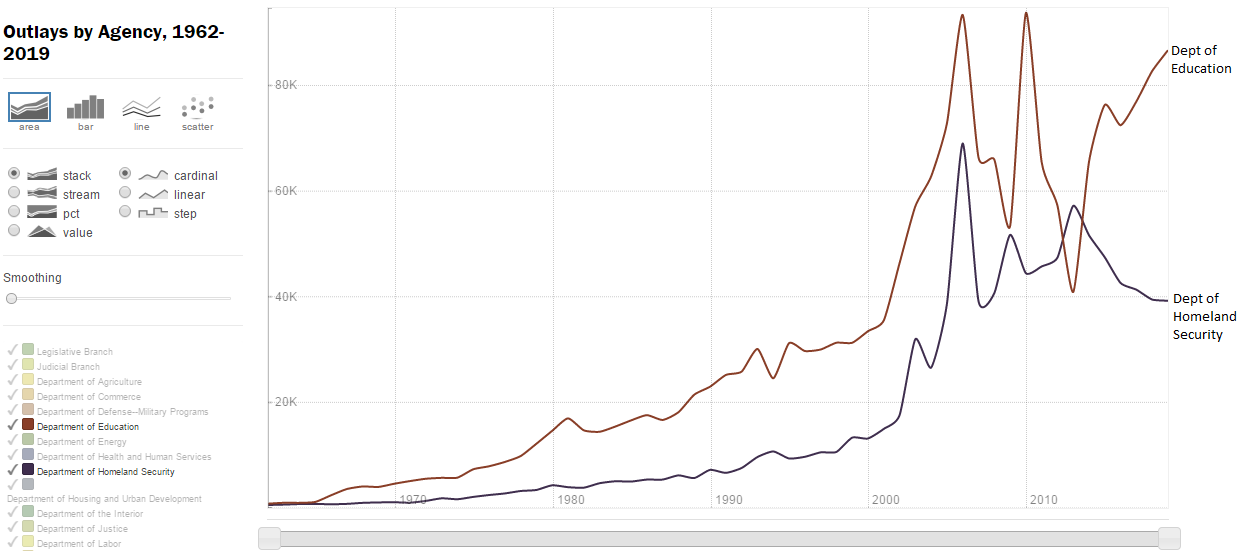
Here at DASIL, we have created a visualization tracking budget spending over time, including estimates until 2019, using data from The White House. You can use our tool to compare outlays for various government agencies.
For example, let’s examine spending on the Department of Education and the Department of Homeland Security: